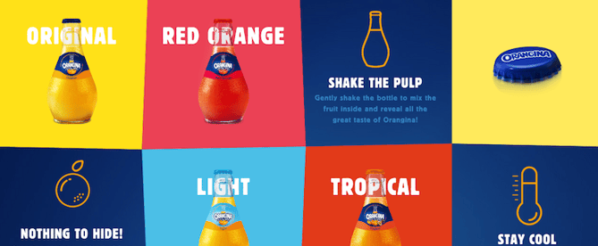
 If you look at how product pages take shape from company to company, you’ll notice they truly run the gamut. Some go for the direct approach and put up an image of their product with short explanations of why visitors should want it. Other companies create elaborate pages with moving parts and fancy coded elements.
Of course, some companies fare better than others at creating awesome product pages. We prefer to focus on the positive, so here are 15 examples that we think are really admirable. They nail it with messaging, value propositions, and promoting their product features in a persona-friendly way…

